Nutrición y Salud
SELF INITIATED UX CASE STUDY 2022
Challenge:
Some users want to lose weight, but some of them are busy most of the day or don't know how to start because they think this might be difficult, but they need more information about it. The city where they live is small, so they don't have many options. But with the website, people can get more information and start with a date and have a healthy life.
The goal:
Design a website where users can get a good option if they want to start losing weight in a proper and healthy way. In the city, this is a good tool because they don’t have many options to find a nutritionist. This website can help them and be guided by a professional.
My role:
As a UX designer, I am designing a website for mobile, tablet, and desktop from beginning to end.
Research study details
Target audience
Conducting interviews paper, digital wireframes, low and high-fidelity prototyping, conducting usability studies, and iterating, on designs.
Initial design concepts
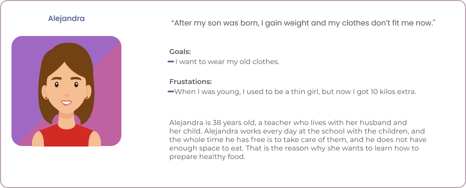
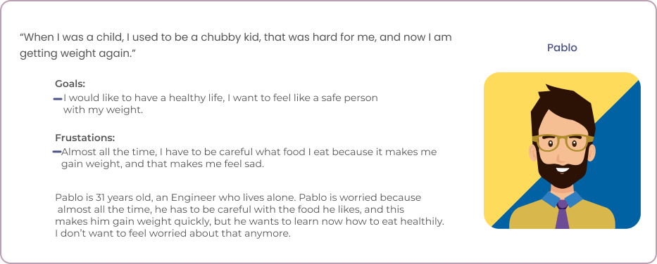
Personas
Wireframes
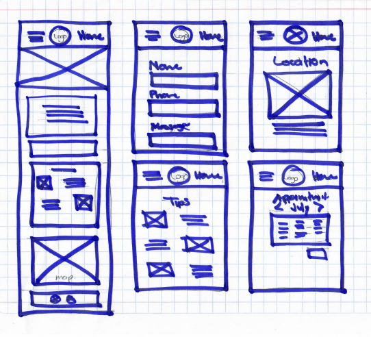
Paper Wireframe
Digital wireframe screen size variations
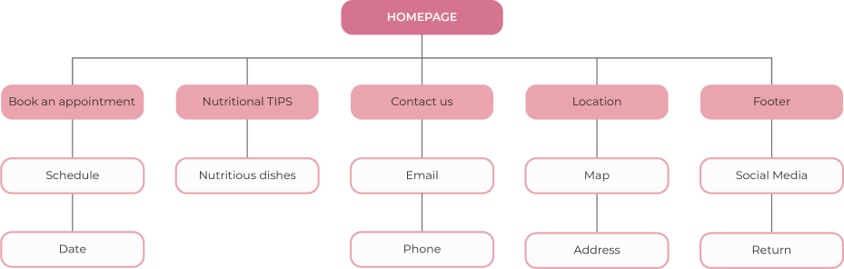
Sitemap
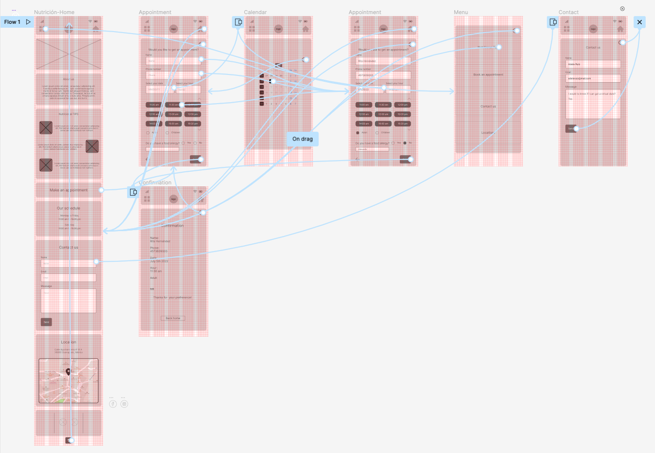
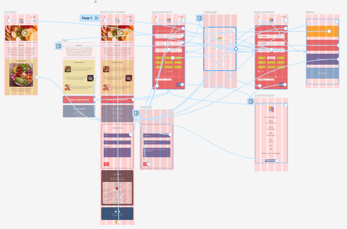
Screen flow
Lo-Fi Screen Flow
User testing results
- Users want to make a quick decision about getting an appointment with a nutritionist.
- People need help to guide them and trust a professional.
- Users want to be accompanied by a nutritionist at all times of their process.
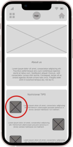
Before usability studies
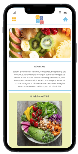
After usability studies
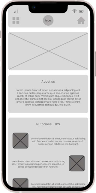
Early designs allowed for some customization, but after the usability studies. I made bigger the images in the Nutritional tips, this was important for users.
Hi-Fi Screen Flow
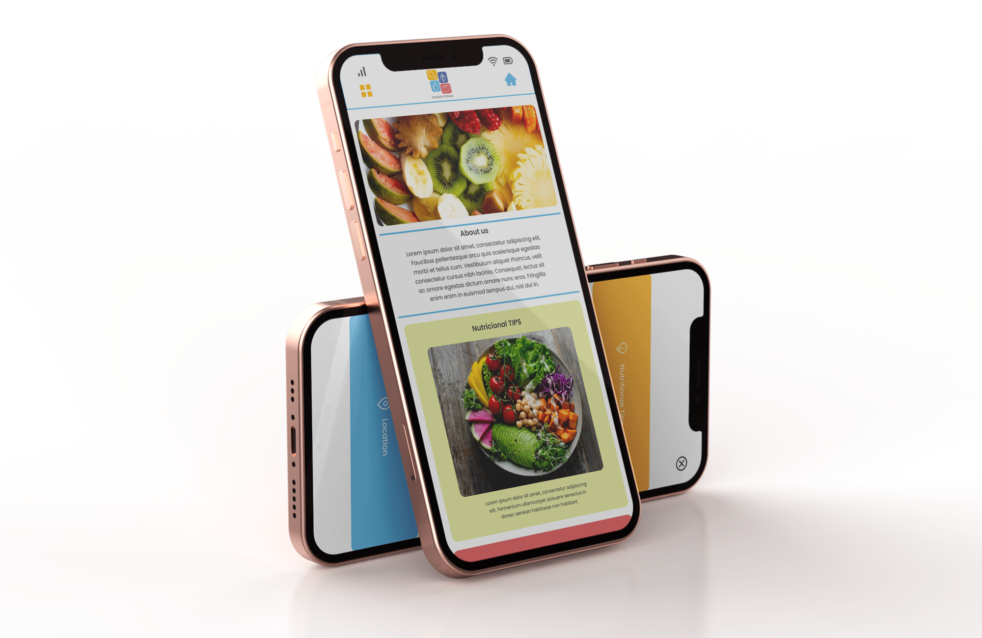
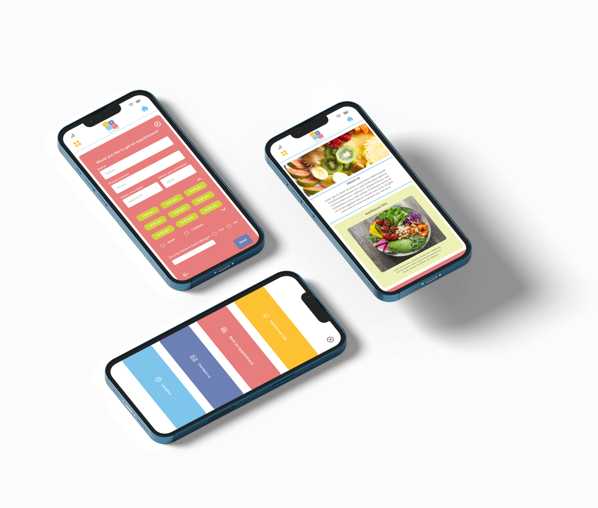
Final Design (Mockup)
What I learned
learned how hard it could be for users to decide to go to the nutritionist. They most of the time think this is a big problem losing weight but just need a little bit of discipline.